Business
In a world where brands crave originality and a deeper digital identity, traditional agencies often fail to deliver the craftsmanship and personalization that modern businesses expect. Bureau Cool was founded as a boutique design and digital partner studio, focused on delivering highly curated, detail-driven design solutions that stand out in a crowded digital landscape.
The vision was to build a platform that showcases their craftsmanship in branding, web design, digital content, and creative strategy—all with a handcrafted, boutique feel. Bureau Cool wanted a website where clients could explore their process, experience immersive case studies, and understand the depth of their creative thinking.
We developed a premium digital experience featuring editorial-style layouts, micro-interactions, minimalist animations, and a smooth, art-direction-led UI that feels intentional and handcrafted. The result was a boutique website that communicates refinement, creativity, and high-end partnership.
Business Problem
Our client had the expertise, taste, and creative identity—but lacked a digital space that matched their standard of work. Their existing presence didn’t properly reflect their boutique positioning or the depth of custom design solutions they offered.
Key challenges included:
- No platform to display high-end design work
- Inability to communicate their process and craftsmanship
- Generic visuals not aligned with boutique brand values
- Limited digital storytelling for case studies
- Weak brand perception online
- No structured service explanation or client onboarding flow
While bigger agencies were gaining visibility through strong digital portfolios, Bureau Cool needed a website that expressed their unique identity—clean, minimal, thoughtful, and creatively bold. The client wanted a digital partner experience where every detail reflects their boutique approach.
The Big Idea
The main idea behind building the Bureau Cool website was to capture the essence of a boutique creative studio quiet luxury, purposeful layouts, and attention to detail while delivering an exceptional user experience.
The client wanted:
- An editorial, magazine-like website
- Smooth interactions but no overwhelming animations
- A storytelling-driven portfolio
- A strategic services breakdown
- A design identity that feels premium and timeless
- A platform that positions them as a long-term digital partner
The goal was to merge simplicity with sophistication creating a digital presence that not only highlights their design work but also communicates their philosophy: thoughtful, strategic, and beautifully executed design..
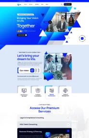
The Bureau Cool platform is a boutique-style portfolio and service experience crafted with minimalist layout systems, intentional typography, and editorial-level visual hierarchy. It includes:
- Detailed case study pages with process storytelling
- Structured service breakdowns
- Portfolio galleries with hover micro-interactions
- High-end typography and grid systems
- Smooth scroll transitions
- A CMS for easy case study and blog updates
The entire site is built to feel clean, sharp, and premium—like a digital design magazine. Each section flows smoothly, encouraging clients to explore their capabilities and understand how Bureau Cool works as a digital partner.
Our Process
We explored boutique studios around the world, noting gaps like over-animation, unclear messaging, and lack of storytelling. We also studied how design-focused clients browse portfolios, and what helps them choose agencies.
We mapped key user journeys: exploring case studies, learning about the studio, understanding services, and contacting the team. Our designers used a strong editorial direction—clean spacing, bold typography, and minimal grids—to craft a premium aesthetic.
We implemented smooth transitions, micro-interactions, and a modular CMS. Pages were built with lightweight animations and performance-focused layouts to maintain the boutique experience without compromising speed.
We tested readability, spacing systems, animation smoothness, responsive behavior, and CMS performance. Once polished, the site was launched with SEO, analytics, and performance optimization.
Challenges
Creating a minimal design that still feels premium, expressive, and high-end required careful balance.
Typography had to carry the entire aesthetic—ensuring consistency, legibility, and personality across all pages was a key challenge.
Boutique websites need elegance, not chaos. Crafting subtle micro-interactions that feel intentional required precision.
Case studies needed a flexible, storytelling-driven CMS structure that designers could update easily without breaking layouts.
Everything—from spacing to type to movement—had to reflect their identity: curated, calm, premium, and thoughtful.
Solution :
We built a custom grid and editorial layout style that brings a high-end, magazine-like feel to the entire site.
Case studies were designed with step-by-step storytelling, large visuals, process description, and interactive elements.
A refined type scale with careful spacing and rhythm reinforces the boutique feel across all pages and devices.
We added subtle hovers, transitions, and scroll reveals that enhance experience without overpowering the minimalist design.
The backend supports galleries, text blocks, process sections, and testimonials—making case study creation simple and flexible.
App Screenshot :